


The three elements of color: Unveiling the visual secrets of acetic acid board, saying goodbye to the "color difference" problem in material selection
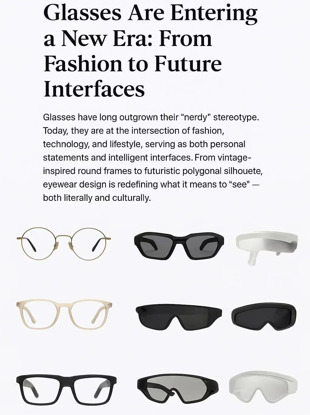
As designers' inspiration flows across blueprints, craftsmen's deft hands precisely shape the molds, and buyers' eyes wander among samples—the color expression of acetate sheets is crucial in determining the soul of a pair of glasses.
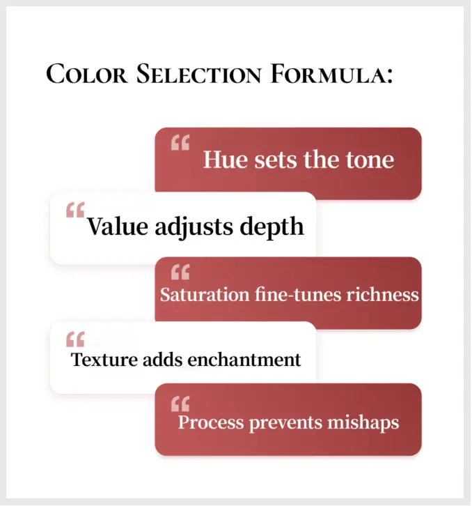
Understanding the three key elements of color (hue, value, and saturation) is the core principle of mastering the visual presentation of acetate sheets. This not only impacts aesthetics, but also efficiency, cost, and the product's ultimate market performance.
What is hue?
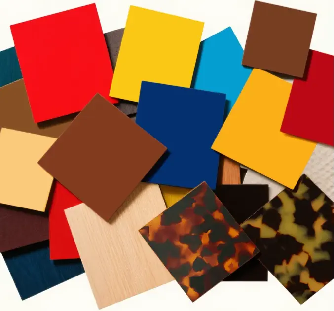
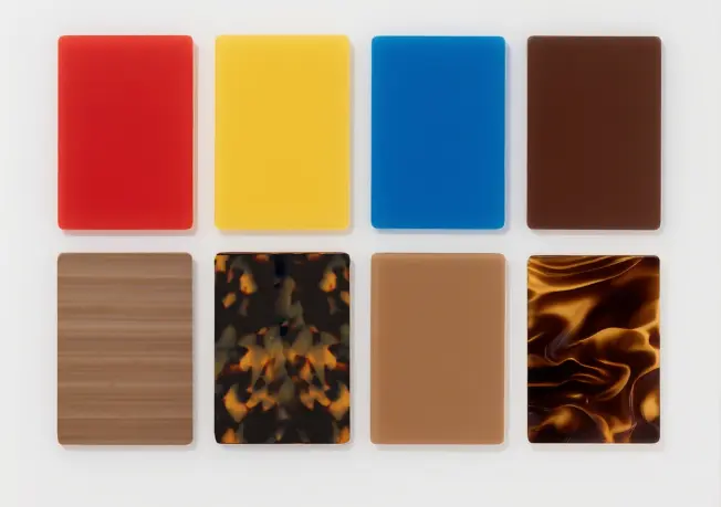
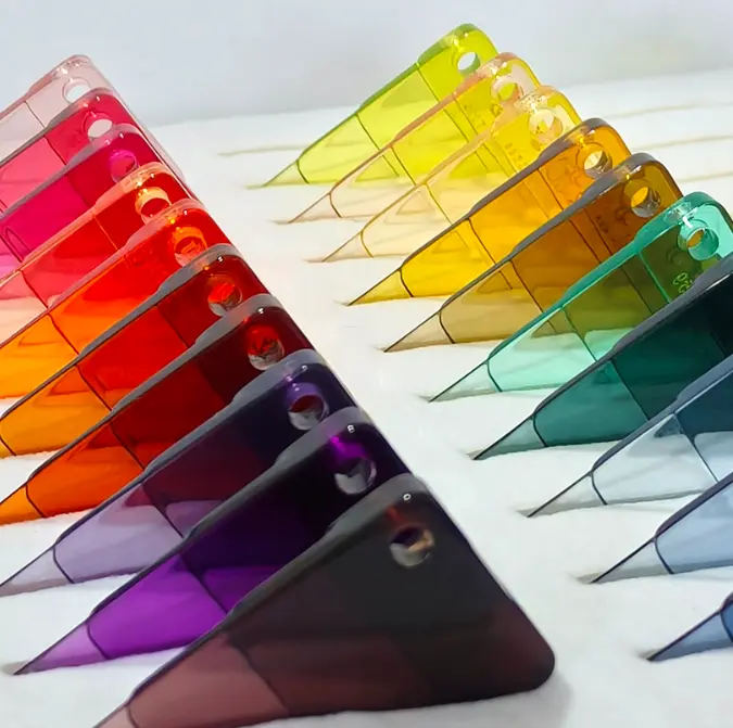
Basic hues of color,
(Names of colors, such as red, yellow, blue, tortoiseshell, and brown)
Color characteristics of acetate sheet:
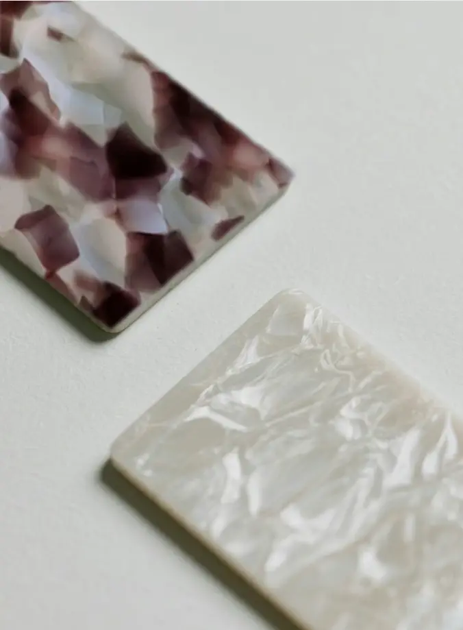
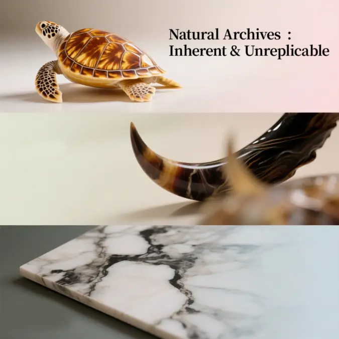
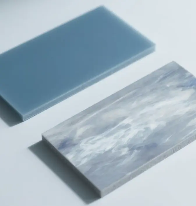
● Natural color library: the amber gold of tortoise shell, the deep gradient of ox horn pattern, the freehand ink splash of marble pattern... The texture of each board is a natural color palette, the grain is the hue, and a single cut creates a unique color combination.
● Hundreds of artificial hues:From classic colors to fluorescent trend colors, we have full coverage.
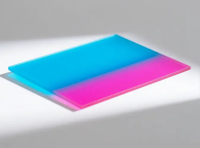
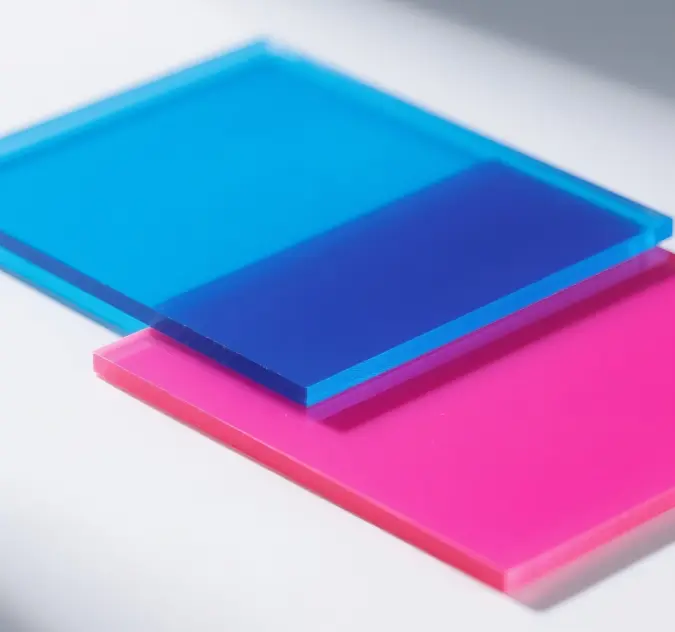
● Two-color/multi-colordip-dyeing process:Through multi-color penetration technology, precise hue transitions (such as blue to pink gradient) or contrasting color boundaries are formed within the single board, achieving color fusion that cannot be replicated manually.
Tips for selecting acetate colors:
Same hue + different crafts = completely different effects!
What is saturation? The vividness/purity of a color, also known as "purity (phosphor = high saturation, gray = low saturation)."
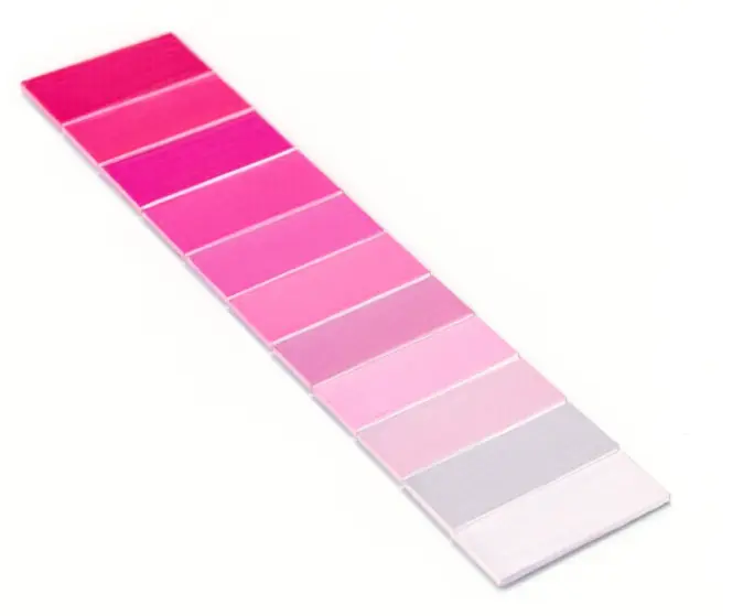
Saturation characteristics of Acetate material:
● High saturation presentation: Cellulose acetate can present extremely pure, bright and highly saturated colors (such as electric blue and neon pink), which are vibrant and highly recognizable.
● Low-saturation charm: Soft and elegant low-saturation colors (such as Morandi colors and stone gray), combined with subtle changes in natural textures, easily create a low-key, luxurious, quiet and advanced "gray tone" atmosphere.
● The magic of texture: The more complex the pattern, the lower the visual saturation. Natural textures (such as tortoiseshell and stone patterns) can naturally "break" the monotony of color, visually reducing its perceived saturation and making it richer and more appealing.